

Office relocation project part 2: Design and interior
The main theme we wanted to prioritize for our new office this time was employee health and comfort.
Since I work in a fast-paced industry, I wanted the office to have a calm and healthy atmosphere. It was also essential that the space be bright and comfortable.
Also, since we work with a variety of clients and are involved in a wide range of tastes and fields, we thought it would be best to give the office a neutral impression. This gives it a more mature feel and is definitely more modern.
FLOOAT's characteristic natural and chic taste was used to give the whole look a soft feel, while the details were carefully chosen.
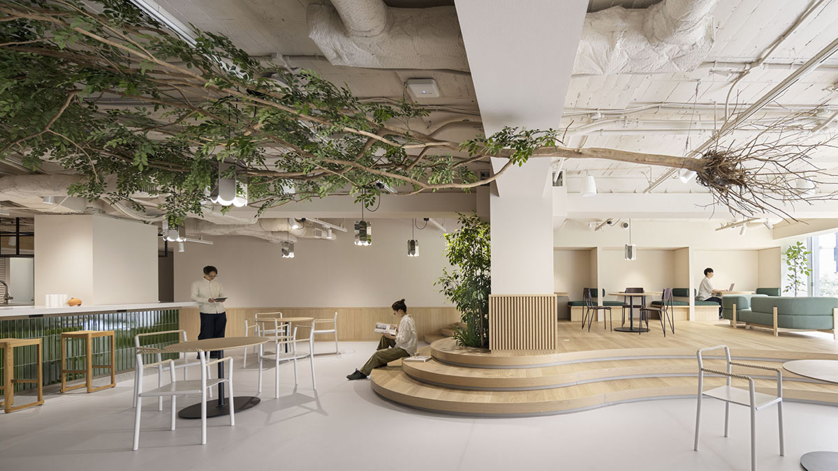
First, the color of the walls. They are painted a very subtle shade of beige. They chose an exquisite color that doesn't look cold in the morning, doesn't look gray in the shade, and doesn't look washed out by fluorescent lights. It's a chic color with nuance.
In fact, the ceiling panels are also painted the same color.
One disappointment this time was that due to budgetary constraints we were only able to cut through part of the ceiling and had to use the "office" style ceiling panels as they were, but I think this could have been mitigated by painting the ceiling the same color as the walls.